Two Rules of Thumb on How to Color Coordinate Your Space
Two Rules of Thumb on how to color coordinate your space
For many clients, choosing a color palette for their room design is not an easy task. The variety of colors and their shades seems endless and so confusing. Choosing colors and using them in the right proportion can seem like a frightening and daunting task. However, interior designers have some tricks up their sleeve and here are some pointers and guidelines by interior designer Annette Frommer to ensure that the choices you make work well together and provide you with the kind of space you’ve always envisaged.
The magic numbers: 60-30-10
“These numbers will save you from making harsh mistakes. No matter what your color preference is, these are the numbers that will help you use the colors you choose in the right proportion. The way it works is like this: The main color that is chosen for the space will be used in 60% of the space. This color should be like the background color, the canvas of the space. It should be some kind of a neutral base color that is quiet, soft , subdued, and definitely not overwhelming. The second color that you choose will be used for 30% of your space. It should be bolder, brighter, with more of a presence . The last 10% of the space is the accent color whether throw pillows, curtains, a statement armchair, or light fixture”.
According to Frommer this axiom is really the key and if you remember it, it will save you from making drastic mistakes.
Balance and harmony
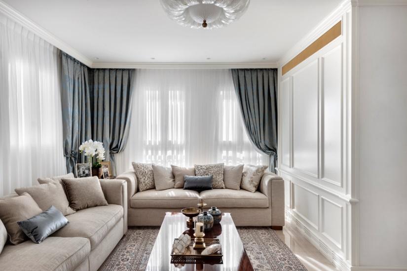
Photo: Oded Smadar
For example, in the room above, designed by Frommer, white is the dominant color. The sheer curtains are white; the marble flooring is a shade of white, as is the large wall panel and ceiling light fixture. Beige is the secondary color. The sofa is beige as are some of the scatter pillows and the area rug. Finally, blue is the accent shade chosen for this space, as can be seen in the two blue pillows and the second layer of the curtains.

Warm/hot colors set the tone for this basement designed as a family room. The space speaks fun, entertainment and playfulness.
Photo: Elad Gonen
Cool colors/warm colors or vice versa
The color wheel or color circles show the relationships between primary colors, secondary colors and tertiary colors. There are usually 3 primary colors, 3 secondary colors and the colors formed by mixing a primary color and secondary color are called tertiary colors. In more detailed color circles more shades are included.
Warm colors are generally considered to be the vibrant colors such yellow, orange, red etc. while cold colors are generally the purples, greens, blues and greys. The choice of colors affects the feeling that is exuded in a space. For example, a lot of black will feel depressing and sad, while brighter colors inspire a sense of joy and delight. Think about this when making your choices. As Annette Frommer says “There is energy in every room of a home. Try and define the kind of energy, the type of vibe that you are searching for, the kind of feeling that you wish to create in your space. Do you want a soothing bedroom, a fun family room, an elegant living room? Colors will greatly affect this”.
Comments
Post a Comment